Font similar to NiziU’s logo

The font used in NiziU’s logo has a symmetrical feel and matches NiziU’s official colors, making it look very stylish.
I was curious about what font is used in NiziU’s logo, so I did some research.
A Font Similar to NiziU’s Logo
To get straight to the point, the official font name is unknown, but I found a font that looks quite similar: “Amsterdam Superstar.”
While it’s not an exact match, I think it’s very close.
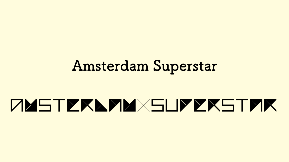
First, here’s how “NIZIU” looks using the Amsterdam Superstar font:
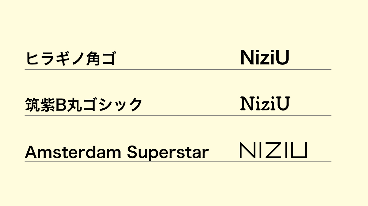
Now, here’s the official NiziU logo:
ついにNiziU OFFICIAL COLORS & OFFICIAL MEMBER COLOR が決定🎉
メンバーカラーともに、
これからもNiziUの応援よろしくお願いいたします‼️https://t.co/31GTgq2ON8#NiziU #ニジュー #WithU #NiziU_Official_Color pic.twitter.com/2HvCmBJIwd— NiziU (@NiziU__official) March 5, 2021
While it’s not exactly the same, it looks very similar!
The Appearance of “Amsterdam Superstar”
All the lines and angles in this font are highly geometric, giving it a futuristic feel. Each letter is designed as if it was made inside a square box, ensuring uniform height and width.
Here’s an example of text using Amsterdam Superstar:
Amsterdam Superstar Alphabet
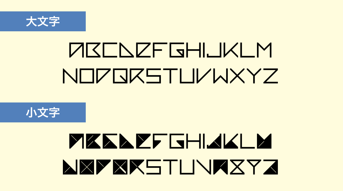
For uppercase letters, “D,” “E,” and “P” are a bit hard to read, but the other letters are quite legible.
On the other hand, lowercase letters have a lot of black-filled areas, making most of them difficult to read.
This font might be best suited for words like “NIZIU,” where the letters are easy to recognize at a glance.
NiziU Members’ Names in Amsterdam Superstar
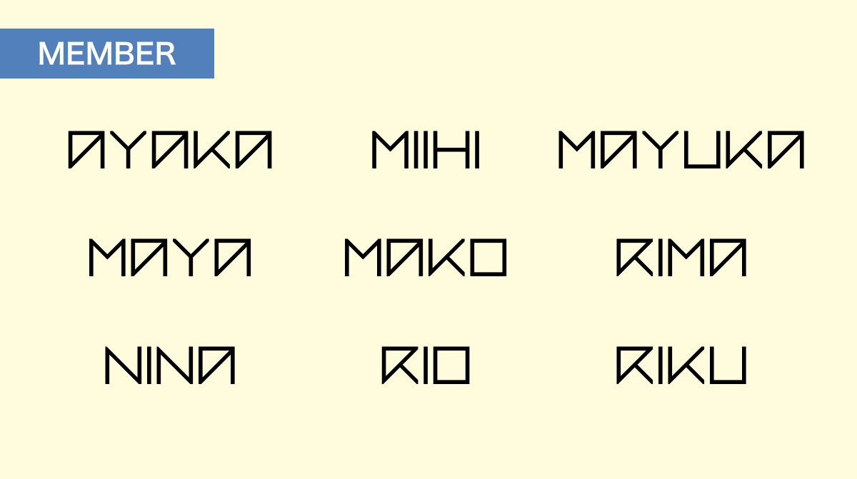
I tried using this font with the names of NiziU members.
When names contain letters like “A” and “R,” they become harder to read.
By the way, I just noticed that NiziU members’ names contain a lot of A’s and R’s!
Conclusion
In this article, I introduced the Amsterdam Superstar font, which closely resembles NiziU’s logo.
The font has a highly geometric structure, giving it a futuristic look.
If you download Amsterdam Superstar, you can use it in Adobe XD, Photoshop, and other design tools.
Give it a try!